
Hannah Baker is a facilitation educator based in Berlin with 15 years of experience, a Master's in Education focused on Visual Thinking Strategies, and a co-founded school called the Fountain Institute. Her LinkedIn posts are sharp, specific, and slightly irreverent. But her website looked like every other consultant's.
What I didn't expect was that the project would reshape how I think about design itself.
The deliverables aren't a traditional brandbook, screens or templates. They're a governance layer, a voice matrix, a concept graph, a processing tool, and a set of executable skills. The work is the infrastructure that enables Hannah to scale her brand.
I designed the instructions, the rules, and the tools. Hannah executes. The brand stays hers.
Audit and discovery
I read through everything, months of LinkedIn posts and her websites. Focusing on the visuals and the patterns in how she communicated. Then I let Claude do a full scan on the content to surface voice patterns, structural habits, and tone attributes.
This is where AI fits into my process. The heavy lifting of pattern extraction across hundreds of posts is tedious and error-prone when done manually. Claude handles that. But the output is a report, and a report needs interpretation. I spent the time comparing my own notes to Claude's analysis. The understanding came from the comparison, not from either source alone.
The first deliverable was a 12-page document. A comprehensive report covering her voice and tone, structural patterns, voice attributes, a full visual audit of her website, and the context she'd shared with me in our initial conversations.
A few things were clear from the audit. Her verbal brand was strong. The sentence rhythm was distinctive: short punch, then expansion. She led with tight observations and unpacked them. Her content centered her audience's struggle before her own solution. She referenced external frameworks from museum education, AI research, economics, positioning herself as a facilitator.
The visual brand was a different story. Black-and-white photography that worked well. A yellow accent color that felt arbitrary, more startup SaaS than seasoned facilitator. No distinct visual language beyond the photos. The website could have belonged to any consultant in any field. And the copy on the site didn't match her LinkedIn voice at all. It defaulted to consulting-speak: "tailored solutions," "impactful outcomes," "strategic results." The person who wrote those LinkedIn posts would never write that.
I left some paragraphs in the report intentionally harsh. I wanted to see Hannah's reaction. Whether the findings resonated with her own sense of what was off. We reviewed the document together in our first session and polished it collaboratively. Everything landed.
This answer shaped the whole project framing
If your brand were a celebrity, who would it be?
Most people name musicians, actors, public figures. Hannah named Buckminster Fuller. John Oliver. Jerry Saltz. Marcel Duchamp. Donella Meadows. Gropius Bau. Sal Khan. Paula Scher. Josef Albers. Sol LeWitt.
Every single one connected to design, art, science, education, or systems thinking. This wasn't aspirational branding. It gave me an intellectual map.
Fuller, the comprehensive anticipatory design scientist who invented his own syntax because existing language couldn't hold his ideas. Duchamp, who understood art history deeply enough to redefine what counts as art. Albers, who proved that constraints and exploration feed each other. Donella Meadows, who built systems that improve by tightening feedback loops. Sol LeWitt, whose art was a set of instructions that anyone could execute. Paula Scher, who communicates through everything and treats identity as a language that governs behavior over time.
I started laying out a moodboard from the brand websites Hannah admired: Walker Art Center, MoMA PS1, Criterion Collection, Printed Matter, Bunkhouse. Then I took all her responses, the characters and their associated concepts, and started building a relationship graph. I needed to visualize this before going deeper.
I spent hours reading about each person, connecting dots between their ideas, and falling into philosophical debates with myself about art, design, and technology. This part was entirely manual. Not because AI couldn't help, but because the understanding had to be mine. I was building a conceptual foundation that every future decision would rest on.
My whole view on design shifted from a single Buckminster Fuller quote I encountered during this research: "Design is the development of structuring of environments in preferred directions."
That sentence connected to everything I was already working on but couldn't articulate. The agentic design system infrastructure I was building at my day job. The skills and rules architecture. The idea that a designer's most valuable work might be structuring the environment where others create, not creating the artifacts themselves.
I can articulate it now.
Connecting the dots
I built a concept graph as a React artifact in Claude, a force-directed network visualization where each person, concept, and brand reference was a node, and the relationships between them were edges. This graph helped me to create a more visual map on FigJam. Something we could shape together with Hannah.
Even the process of creating the celebrities map went beyond concepts. The photos I chose for each person were hand-picked based on how I perceived their personalities and what best described their work. Fuller in his geodesic world. Duchamp with the bicycle wheel. Albers at the blackboard. LeWitt in his studio. Every image was an editorial decision.
I spent more hours improving the connections, adding edge types (defines, informs, reinforces, tensions), and letting the graph reveal patterns I hadn't consciously planned.
Three clusters emerged.
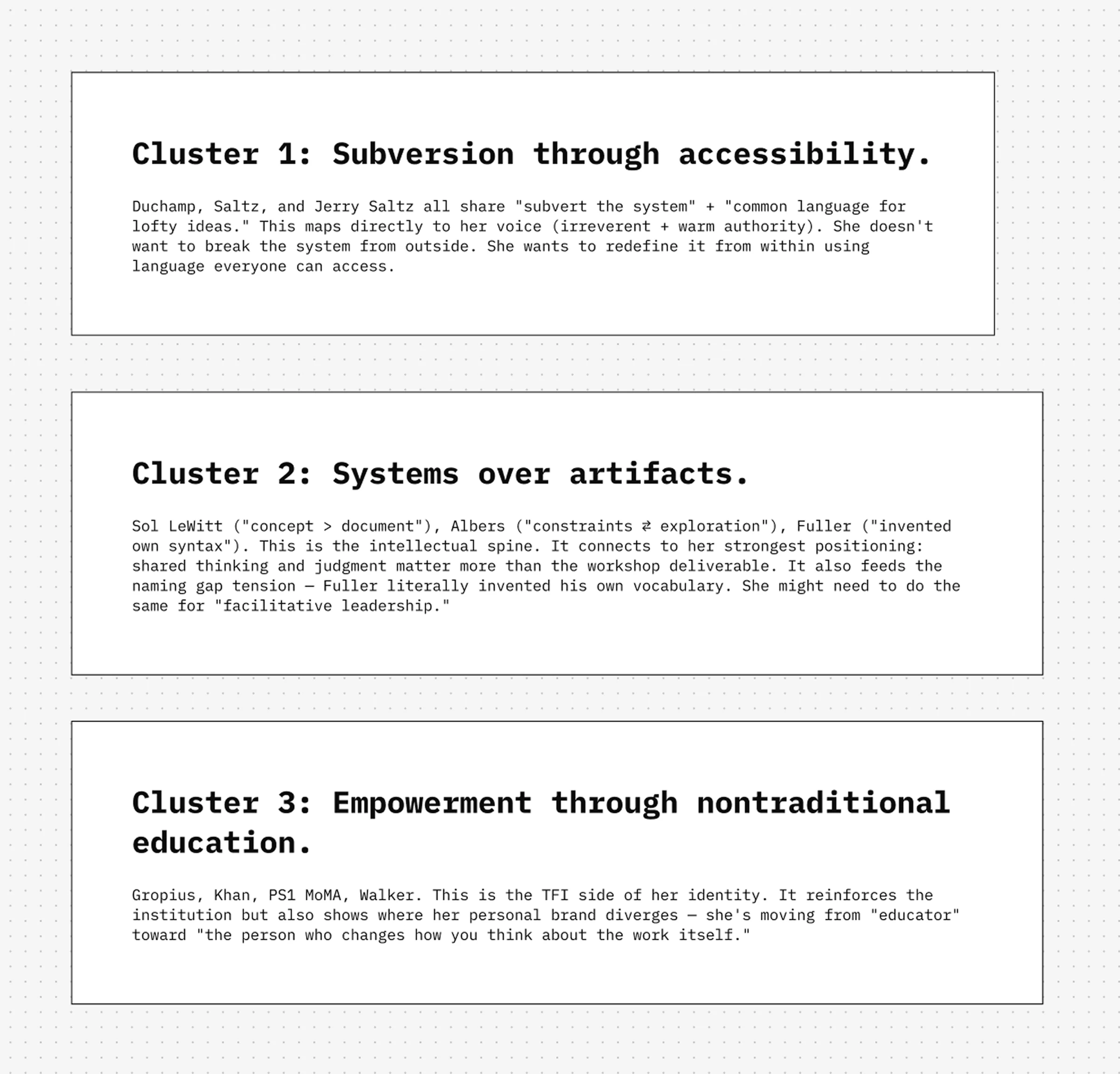
From these clusters, articulating Hannah's brand principles was straightforward. The intellectual lineage did the work. Session two was about reviewing all of this together. "Mind blown" sits short on Hannah's reaction. We spent an hour and a half reviewing and polishing the eight principles.
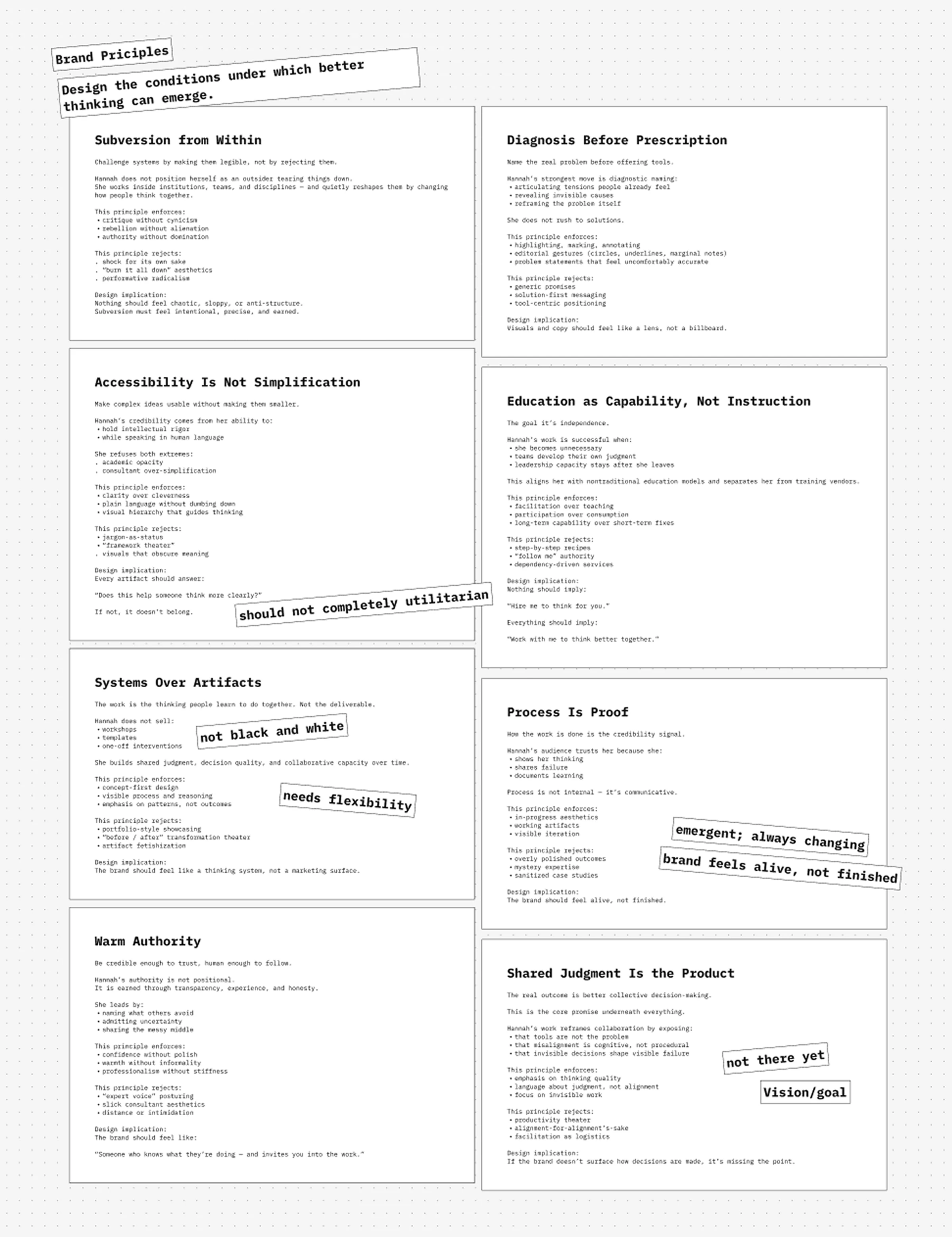
The core identity statement emerged: Hannah designs environments where people can think more clearly together.
The brand posture: Intellectual Punk. Deeply credentialed and rejects establishment framing. Punk through mastery, not posturing. She earns the right to subvert by being undeniably good.
Encoding the Brand
Eight principles. A positioning framework. An intellectual lineage. A concept graph with traversable relationships. Now the question: how do we use this?
From talking to Hannah and auditing her audience, I took the Intellectual Punk concept and created a voice and tone matrix. Two axes: Punk to Institutional on the horizontal, Intellectual to Visceral on the vertical. Four quadrants, each mapped to specific content types and use cases.
A provocative LinkedIn essay lives in Punk + Intellectual. A workshop curriculum lives in Institutional + Intellectual. A vulnerable personal story is Punk + Visceral. A designed learning experience is Institutional + Visceral.
The strategic insight: Hannah doesn't pick a quadrant. She knows which one she's in at any given moment. The brand's power is that she moves between quadrants with intention, the way a facilitator moves between listening and directing.
This matrix, combined with the principles and concept graph, gave me the knowledge base I needed to build something I'd been thinking about for a while. A brand skill. Think of it as a brand book built for AI consumption. Everything structured, referenced, and machine-readable. The meta skill doesn't generate content. It governs how content gets generated.
Other skills consume this. A LinkedIn post skill references it to select the right voice quadrant. An email skill reads the positioning to calibrate tone for the recipient. A course design skill uses the principles to validate structural decisions.
My work on agentic design system infrastructure directly informed this architecture. The three agent layers I use there (Instructions, Rules, Skills) translated to brand work. The meta skill is the instruction layer. The voice matrix and principles are the rules. The content-specific skills are the execution layer.
Hannah is now using this system daily. She's writing a full playbook for her practice using Claude, with the meta skill shifting her voice depending on the medium and the audience. She's redesigning her course using skills that reference the brand governance layer. She creates emails where the tone calibrates automatically based on whether she's writing to a potential client, a peer, or an enterprise team.
We set the constraints. The system guards the brand.
Solving the visuals
The verbal infrastructure was working. Now: how does all of this look?
We worked on the visual direction across a couple of sessions. Deep moodboarding. Ranking different ideas. Testing them by generating visual artifacts like website layouts and social media graphics.
What Hannah loved was heavily influenced by art. Makes sense. She worked in museums. It was also influenced by the Fountain Institute's existing visual language. Also makes sense. She designed and built that. The challenge was differentiating her personal brand from the Institute's collage-heavy, institutional visual style while keeping the intellectual DNA that makes both brands hers.
The direction landed on something I'd call intellectual punk collage. Halftone textures over B&W portrait cutouts. Geometric wireframes and connection lines. Red accent typography on blush colorful backgrounds. Layered compositions mixing classical imagery with graphic elements. Vintage TVs next to anatomical brain illustrations. Crowns on contemporary portraits. Satirical workshop agendas.
During one session, I was showing Hannah some visual elements I'd been working on. Simple line shapes, geometric patterns, systematic compositions. She told me they reminded her of Sol LeWitt's work.
I found it fascinating. But it didn't click immediately. I couldn't make the connection at the time.
Later, I realized I'd been working at the same abstraction layer without consciously choosing to. Defining rules and systems that enable visual output, rather than designing the output directly. LeWitt's wall drawings were instructions. Anyone could execute them. The art was in the system, not the execution.
The same thing was happening here.
The Scalability Problem
The visual direction was getting closer. But the closer it got, the more Hannah raised a concern: how replicable is this?
Punk collage is inherently art-directed. Every image needs processing. Every composition needs human decisions about what to layer, how to treat the source material, what goes where. You can't template this the way you'd template a clean corporate brand system.
Hannah needs to focus on her business. She can't spend hours on each graphic. A traditional asset library would need hundreds of pre-made elements, and the collage style makes pre-made elements feel dead. The whole point of punk aesthetics is that it's composed, not stamped.
She was already using cutouts and halftone treatments in her previous work, but the asset library felt outdated. We were thinking about print artifacts, art styles, and production methods. Punk uses a lot of cutouts and halftone images. The texture is core to the visual identity.
I started looking at existing tools. True Grit makes a halftone Photoshop plugin. $29, Photoshop dependency, and in 2026 this feels tedious.
The brand's own fifth principle was staring at me: Systems Over Artifacts.
Half-Toned
Instead of building an asset library, I built the tool that generates assets, add images to a media library and save presets.
Half-Toned is a web-based image processor. Upload any photograph, adjust parameters, export a brand-consistent halftone asset. No Photoshop. No design skills required. Deployed on Vercel, usable from a browser or phone.
The processing pipeline converts an image through four stages. Pre-processing applies blur, gamma correction, and contrast adjustment to the source image. Grid generation computes point layouts in three types: square (with rotation), hexagonal, or radial. Per-point sampling displaces positions using Perlin noise, samples the source pixel, extracts the selected channel value, and computes the dot radius. Rendering draws each dot at its computed position using the selected shape and size.
Nine sampling channels: luminance, inverse luminance, R, G, B, C, M, Y, K. Four dot shapes: circle, square, diamond, line. Perlin noise displacement for organic, non-uniform distortion. Color controls for preserving source colors or applying custom palettes. Transparent background support for layering. High-resolution export at native image resolution.
Built with React 19, TypeScript, Vite, and Tailwind CSS. Real-time preview with zoom and pan. Drag and drop to load images.
Hannah drops in a portrait, tweaks the grid spacing and dot size, selects inverse luminance for that classic halftone look, exports. The asset goes into Figma. She composes the final graphic there, layering the halftone with typography, geometric elements, and other visual pieces. Then she can use Claude to generate variants in different formats.
The tool encodes the visual treatment. Hannah makes the creative decisions.
The System Running
Look at Hannah's communications now. B&W portraits with halftone color overlays in cyan, magenta, yellow, and violet. Geometric wireframes intersecting cutout figures. Bold red typography delivering diagnostic one-liners: "One person preps for hours. Everyone else shows up empty-handed." "The real problem isn't a lack of tools or methods. It's a lack of shared thinking." A satirical workshop agenda that names every facilitation failure her audience recognizes.
Every post was produced by Hannah using the tools and systems this project built. The meta skill handles voice and tone. Half-Toned handles visual asset generation. Figma templates handle composition. Skills that reference the meta skill handle emails, course materials, and long-form writing.
She's building a full playbook for her practice. She's redesigning her course. She's generating marketing assets across channels. All on-brand, all independently.
The brand system self-references. A LinkedIn post skill reads the meta skill to select the Punk + Intellectual quadrant, then applies diagnostic naming patterns to draft the copy. An email skill reads the positioning to calibrate for the recipient's seniority and relationship. A course design skill checks structural decisions against the principles. Half-Toned produces the visual raw material. Hannah composes.
Sol LeWitt wrote instructions that anyone could execute. Different people, different walls, different results. Same system.
Project Components
Research & Strategy
- Voice and tone analysis (12-page audit report)
- Visual brand audit
- Audience demographic analysis
- Intellectual lineage research and celebrity concept mapping
Brand Architecture
- 8 brand principles with design implications
- Voice and tone matrix (4 quadrants, 2 axes)
- Concept graph (force-directed network visualization)
- Core identity statement and brand posture
- Fountain Institute relationship and differentiation framework
Brand Infrastructure
- Meta skill (brand governance layer for AI consumption)
- Content-specific skills (LinkedIn, email, course design)
- Voice calibration system (medium and audience-aware)
Visual System
- Visual direction and moodboard
- Color palette and typography system
- Geometric element library
- Instagram and social media templates (Figma)
- Website design direction
Tooling
- Half-Toned (web-based halftone image processor)
- Figma template library with CLI export pipeline
Stack: React 19, TypeScript, Vite, Tailwind CSS v4, Vercel, Claude Skills, Figma